Katie's
/ PHOTOGRAPHY PORTFOLIO


ASSIGNMENT 1 - LIGHTS
them in such a way that they almost entirely filled up the shot. I thought this really emphasized how much they were moving and allowed to show more of the changes the light was going through over time. Both of these photos feel very light, fun, and exciting!
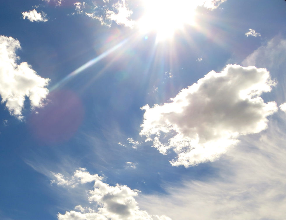
Aside from those, I also chose to take 3 photos of the sun either setting or shining in the sky! The first 2 photos are sunsets, and I thought the depth of all the different colors leading downwards into the point of ultimate brightness was really interesting and photogenic. There's a lot of blending and ombre involved, which I really liked. In the 3rd sky photo, it's just the direct sun reflecting off of the clouds. This photo was put into black and white to emphasize the light hitting off against everything. My favorite part about it is how the light comes off in flares around the ball of sun. All 3 were taken later on in the day. I composed the sunsets to be as far away as possible because the light effects stretched so far that I thought it would be brutal to leave any of it out. In the sky and clouds photo, I zoomed in slightly closer because the clouds only became repetitive around the photo and I only wanted the focus to be on what the sun was hitting. The sunsets photo's are both very whimsical while the sky photo is a bit mysterious due to the haziness and the dark contrasting effect.
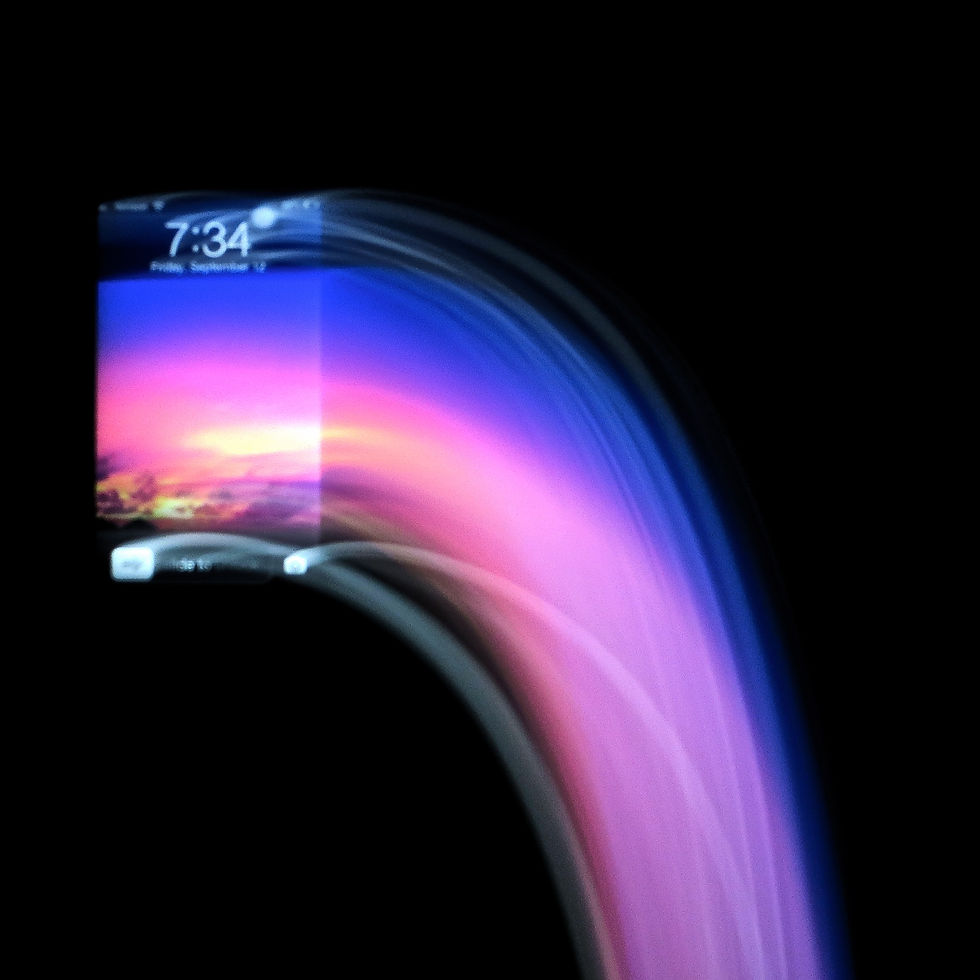
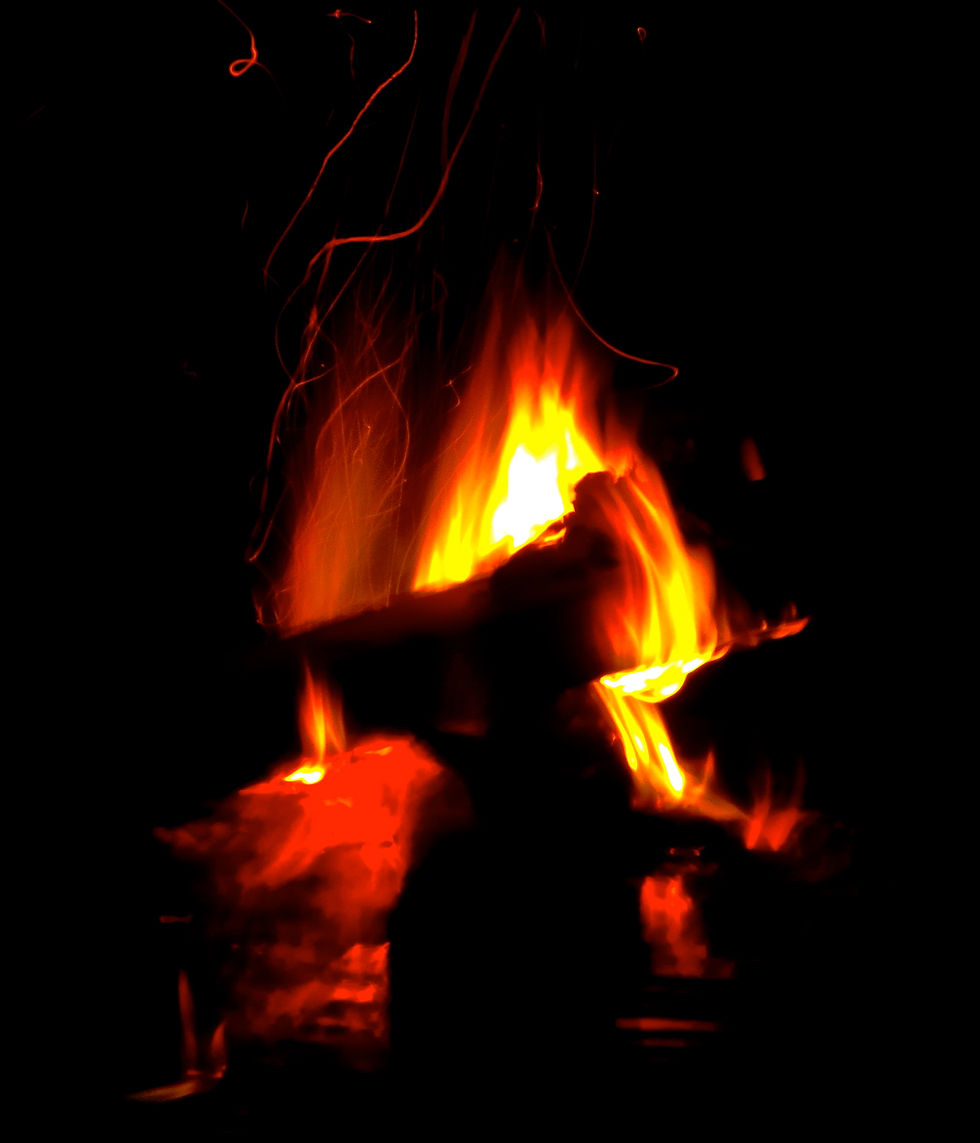
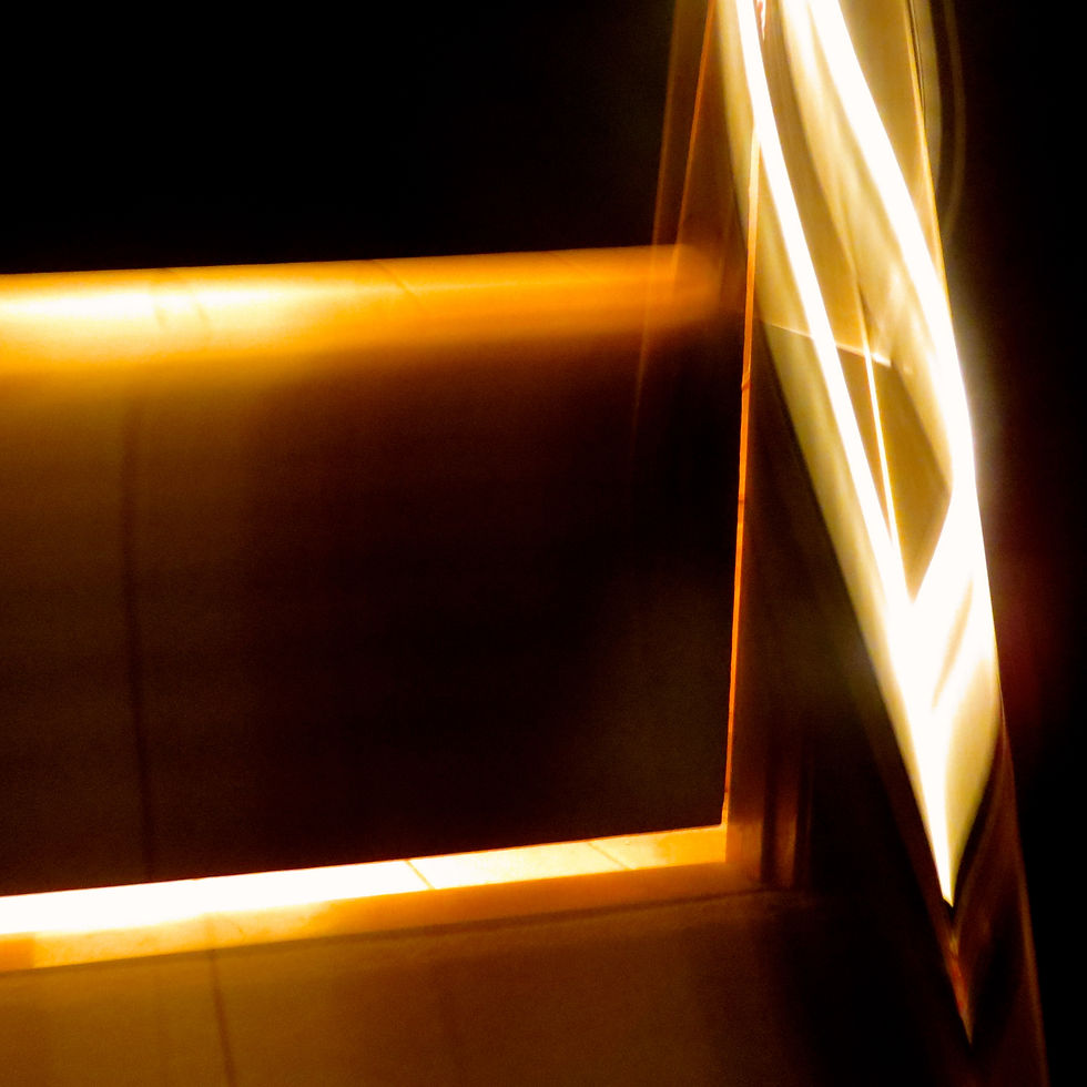
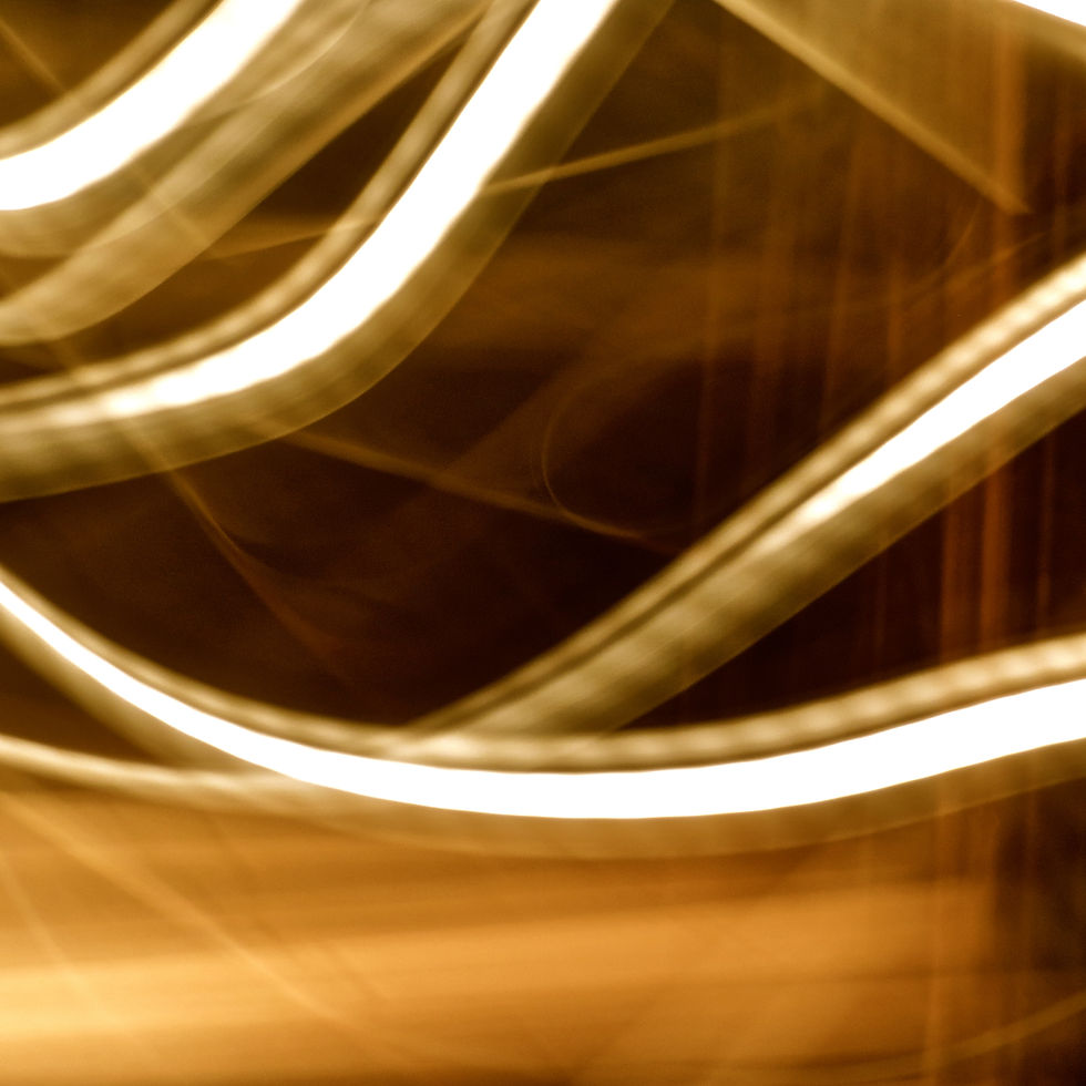
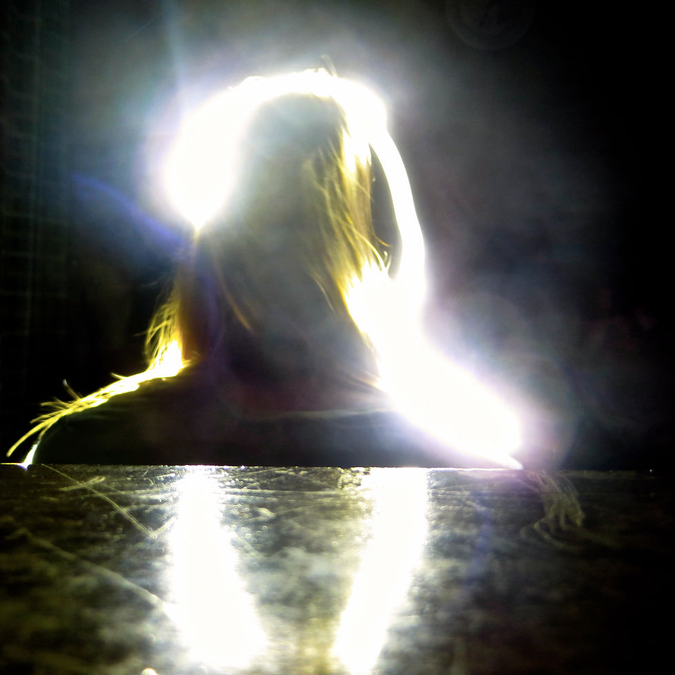
The other photos are all shutter speed effect photos. The 7th and 9th photos in the set are of the light leaking out from around one of the doors in our house. I set the shutter speed to a few seconds and moved the camera around in all different directions to make the light appear as if it was moving and going crazy. The second of the 2 photos then was put into black and white to show the strength of the light and it's path, while I kept the other one in color because I thought the saturation and bright orange and yellows was very interesting and added to the photo. Both photos weren't composed any particular way because I was kind of just spinning and flipping the camera around like crazy to get different movements from the light source. Both of these photos feel very energetic! The 10th photo is a photo of me, taken from behind, with the shutter speed set to a few seconds and a flashlight pointed at my face. It created this cool effect around my head that kind of reminds me of something angelic or heavenly. What else I found really cool was that, in black and white, the contrast almost appears to create the shape of a person in the middle of my head. Composistionally, there was nothing specific I really did. I just wanted to have my head be the center focus of the photo. There were shadows that accompanied the light, and that reflected onto the table in front of the camera. The mood of this is kind of confusing yet interesting and mysterious, because you can't tell who the person in the photo is or where the photo was taken. Photo number 3 was also a shutter speed picture. I set the speed to multiple seconds and then moved my phone in a downward motion to make it appear as though the screen were falling right out of the image. I composed this shot to ensure that the phone started to the left middle and that the light would flow off the screen towards the bottom right. I wanted the photo to take up as much of the photo as possible without overdoing it. I really like the saturation of the colors in this photo; it emphasizes the lights movement and makes it so much more interesting. The final photo left to describe is photo 6, which is of a firepit in my backyard. I took this photo on a small shutter speed so that the flames looked in motion even though it was a still photo. I upped the contrast to emphasize the flames and put less focus on the wood in the center. I love the strong coloring this photo has. It's a very strong photo, and I composed it so that those flames were right in the center and appeared to fly right off the page. Overall, this is probably one of my favorite photos of the bunch because of how serious yet exciting it feels!
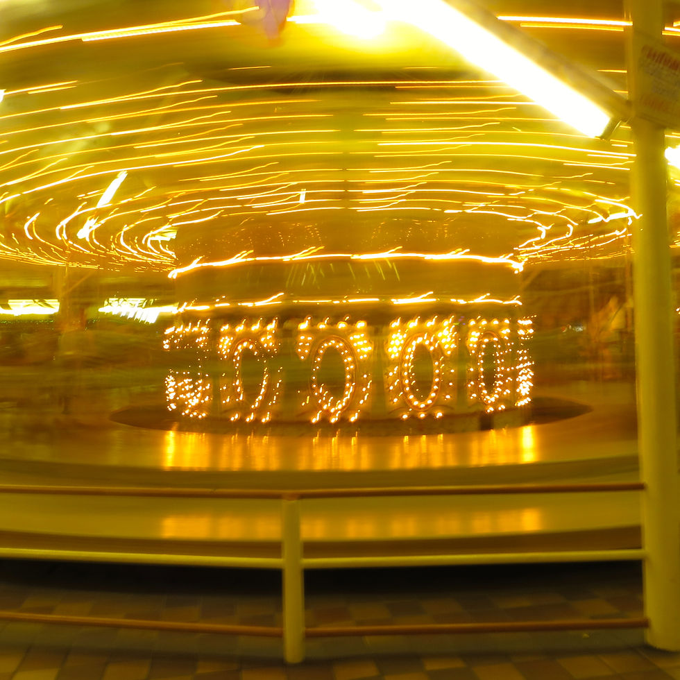
This assignment was about taking shots of light, whether that be direct light, warped light, sunlight, anything! I decided to take a variety of photos.Some of these, specifically the shot of the extreme frisbee and the carousel, were taken during the summer, as an anticipation that this assignment would come up this year! Thanks to it being nighttime, I was able to use a long shutter speed to really capture the light moving so quickly around and around. I think the frisbee shot is especially cool and interesting because the colors kept changing and it gives a really cool rainbow effect. On both, I composed


ASSIGNMENT 2 - CAPTURING COLOR
I changed the color scheme on this photo to a pink scale, and then saturated it to create a pinkish haze effect.

I changed the background of this photo to black, increased the contrast to make it stand out, and then over saturated all of the rainbow colored dots to make them pop.
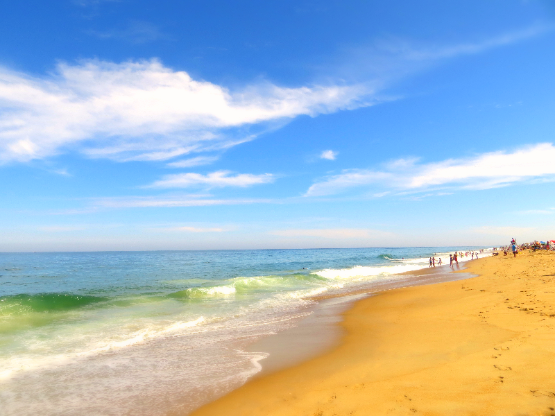
I over saturated this photo to enhance the greenish yellow undertones in the water, the various blues in the sky, and the golden color of the sand.

I changed the background to black, highly bumped up the contrast, and added saturation to the colored lights in order to make them stand out.

I over saturated this photo to brighten and enhance the Red's and Green's in this photo. I also added vibrancy to make the colors pop.
I upped the saturation and the brightness on this photo to make the yellows stand out more against the red.

I saturated this photo and added contrast in order to make the yellow appear stronger against the black background, and the red lines to stand out more.
I added saturation to this photo to make the contrast between the red and the green stand out more.
I added some saturation to this photo to make the blues stronger. The original was much more dull and it looked blah.
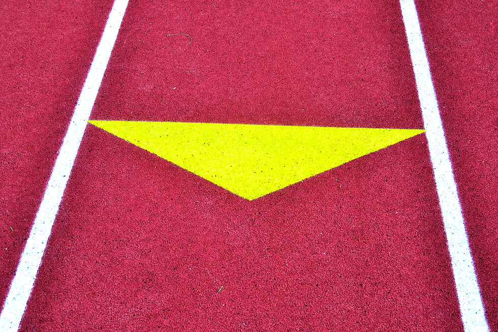
I really upped the saturation on this photo to make the yellow triangle pop as much as it could.
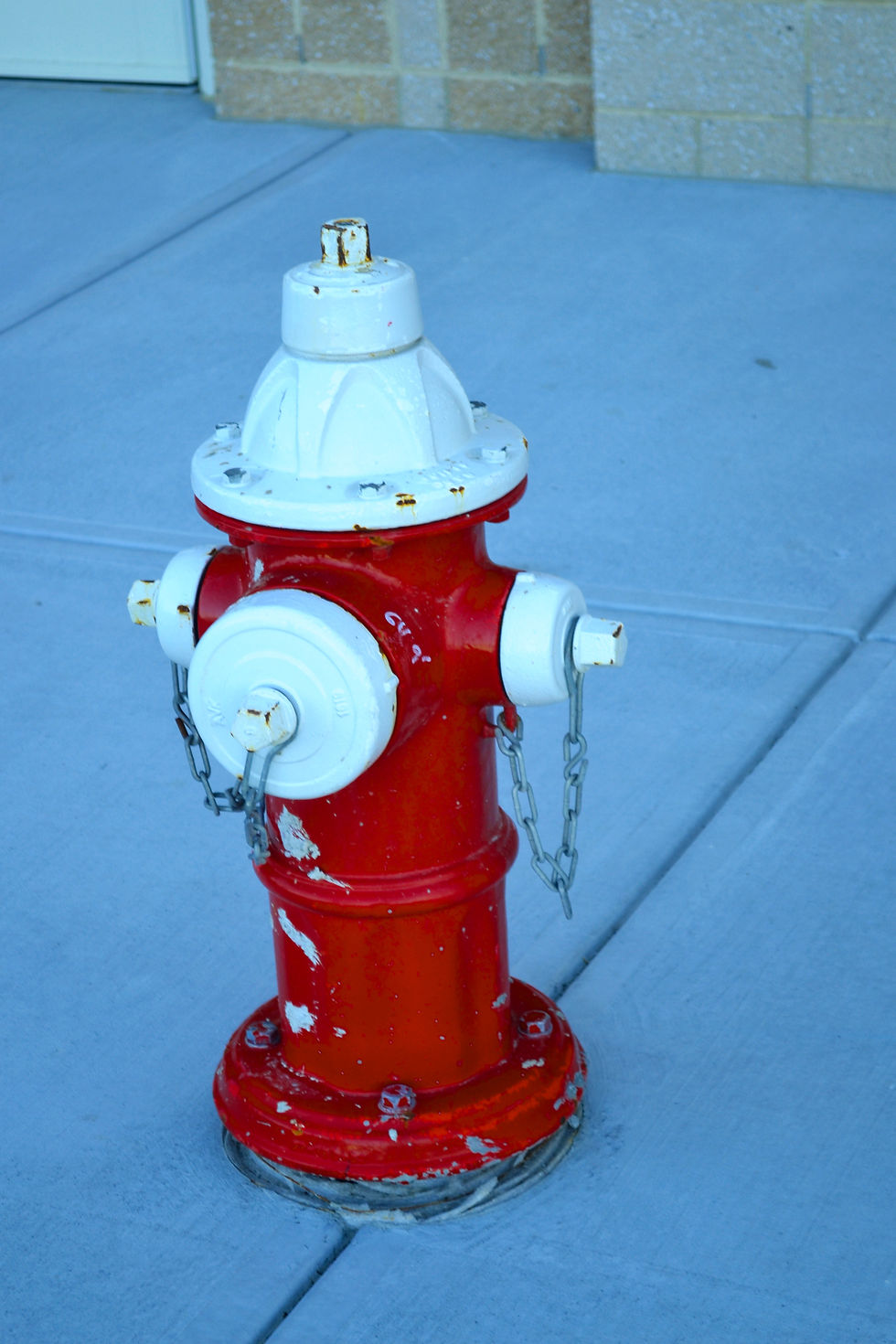
I made the saturation higher to enhance the look of the fire hydrant, and then dropped the blue scale down to make the background more of a grey, which put all the focus on the red.

I really saturated this image to make the blue's, greens, and red's stronger. I also upped the brightness and vibrancy.
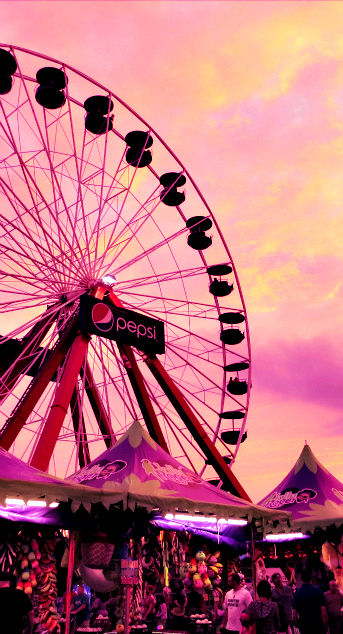
All of these photos represent various places on the color scale, and showcase a wide range of saturation and vibrancy effects. Color is everywhere, so it didn't take me long to create a collection of colorful photos. The locations of my images range from a beach in Maryland, cupcake shops on the streets of NYC, all the way to a parking lot outside of a high school! The colors range from being natural, such as the saturated grassy greens or the blues of the sky, to being manmade, like the bright red track turf and hanging lanterns in a restaurant. The first 4 photos of my collection were my out of school images. In order, they were taken in Ocean City Maryland, the streets of NYC, a beach in Maryland, and Hard Rock Cafe in NYC. I wasn't looking for any particular color schemes: I just wanted to capture interesting colors that stood out to me. In the first photo, I captured a pinkish-red color
scheme. Even before I saturated the photo, the colors making up the photo were very strong and monochromatic. To make color important, I simply tried to just include everything that fit the color scheme into the photo. Each different part of the photo (the ferris wheel, the sky, the tents) made up about a third of the photo. In the second photo, I just took a regular picture with my camera of the dots against the glass wall. It was only when I edited it that the colors really began to pop. These colors were a mix of primary and complimentary, with a lot of reds, greens, yellows, and blues. To make the color important, I changed the background to black and white, which added contrast and made the dots pop. In the third photo, I chose to capture the analagous scale from the bright blue sky to the greenish yellow water to the golden yellow sand. I wanted each color to have it's own section, so I used the rule of thirds to divide them up evenly and to create a natural color scale from the top to the bottom. In the fourth photo, I focused on capturing the rainbow coloring of the lanterns I saw in a resturant. To emphasize these colors, I changed the color to black and white to contrast the lamps and make them pop. The colors are a wide array of colors that would appear on a rainbow. There are many secondary, tertiary, and analogous color schemes in this image.
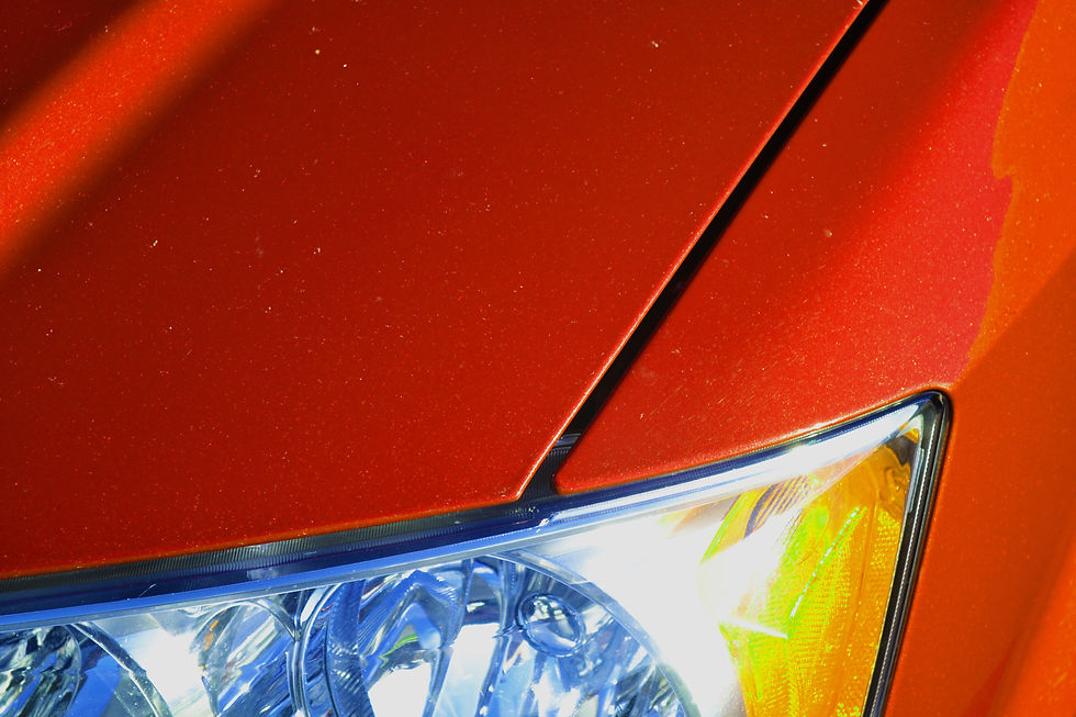
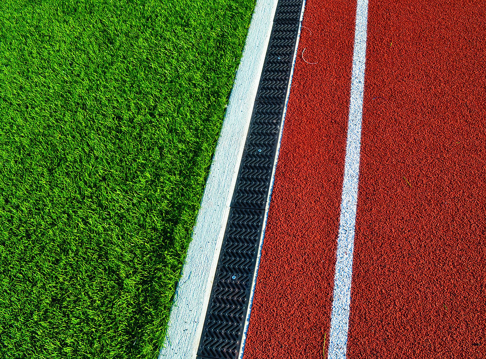
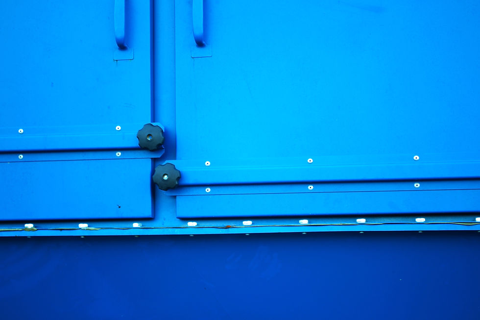
The other 8 photos were taken in class, around the new building and the track. I focused a lot on the red's and greens I was seeing outside. They're complimentary colors and photographed well together. They also had a lot of natural contrast, which I found to be really helpful when editing because it helped to make each individual color stand out more. I also found myself focusing on the blues that were outside, because they looked so bright and it's always been one of the colors I find looks best when saturated. In the first photo, I used the rule of thirds to position the bright red hydrant to the side, which added interest and allowed me to show more green, which, being the weaker of the two colors, worked well and complimented the red. In the second photo, I zoomed in on the hood of a red car and divided it up so that the light was included in the photo. The light added color interest- the yellow and the red are primary colors that work well together! In the third photo, I captured a bright yellow pole that was sitting in front of a dark black background. The contrast was very strong and emphasized the saturation of the yellow pole with subtle red highlights that added compliments. I positioned the pole in the foreground to furthur make it clear that that was the color I was focusing on. In the fourth photo, I took an above, angled shot of the edge of the track. I thought the contrast between the complementary red and green was very strong. I composed it in such a way that each color had their own half, with the angle adding a bit more interest and put an emphasis on the divide. In the 5th photo, I chose to zoom in on a power generator outside of the building. It is a very monochromatic color, with it being completely blue. With the saturation added, it really focused on the coolness and strength of the color. In the 6th photo, I photographed the color contrast between the primary red and yellow. The colors in this photo were very strong and having that yellow triangle in the middle really made the entire photo pop. In the 7th photo, I focused on the bright red of the hydrant against the cool background grey. I think this photo is one of the more interesting color schemes because red isn't usually thought of as being a cool color, but yet in this photo it fits right in with that. The background tones down the red. In the 8th and final photo, I took a landscape shot of the football field. The reds, greens, and blues were all very strong and contrasting against each other, as the red/blue are primary, the red/greens complimentary, and the green/blues analagous. There are so many color schemes going on in this one photo! Overall, each one of the photos above showcases how color is everywhere and what a wide range it can have. There's color schemes in even the most unexpected places.


ASSIGNMENT 3 - CAPTURING EMOTION
These photos represent a wide range of emotions that I captured in the people around me over the past few weeks (and months, for the New York City photo). All of them were changed to black and white to strongly emphasize the emotion happening. I really tried to keep away from staging any of the photos: I wanted the emotions to be natural, and I think I really accomplished that in this series.
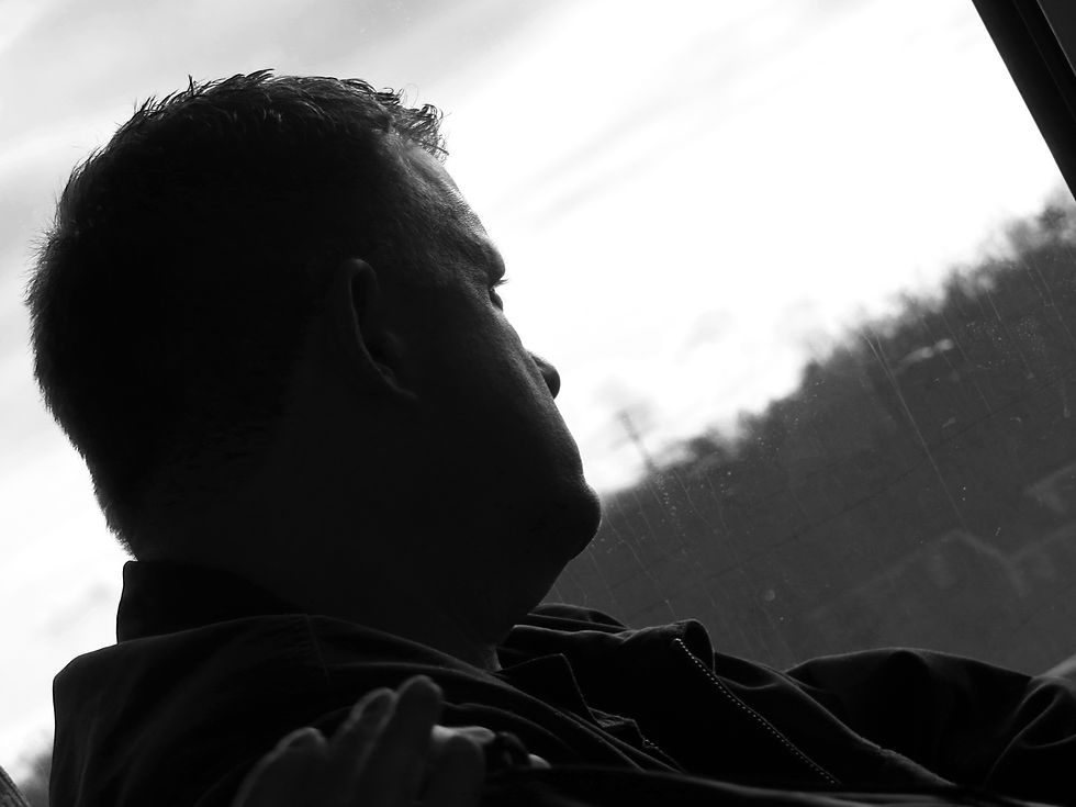
In the 1st photo of my collection, I captured a photo of my dad as he was looking out the window. He hadn't even known I had taken the photo, so there is a sense of realness that I'm really glad to have captured. The background scenery adds to the overall feeling of the photo: it's a good tie in to what's going on and hints that he's looking out at something. It's also very dull and faded, which puts a much greater focus on him. This photo has a feeling of longing and possibly even sadness, because you don't know what he was looking at or why the expression on his face is so neutral. Technically this is a really great photo because the focus is on him, there's a lot of contrast, and the light source just hits the front of his face, helping to reveal the emotion. I also really like dark triangle in the upper right hand corner- I think it helps keep the photo color scheme balanced.
In the 3rd photo of my collection, I took a self-timer shot of myself in New York City! We were in our hotel, stranded and forced to shelter until the extreme downpours going on outside had passed. I really wanted to get back into the city, so I had spent a lot of the time sitting on this windowsill looking at everything going on outside. I decided it'd be perfect to catch that moment, so I set the timer on my camera to 10 seconds and positioned myself. In black and white I feel like this photo has so much mystery and emotion going on! It's very indirect emotion: the feelings aren't picked up by my facial expression but by my body language and the scenery around me! The contrast is amazing and the light source hit the outline of my body perfectly. Looking at this photo makes me feel the way I was feeling that day: awestruck and longing to go back into the streets of New York!
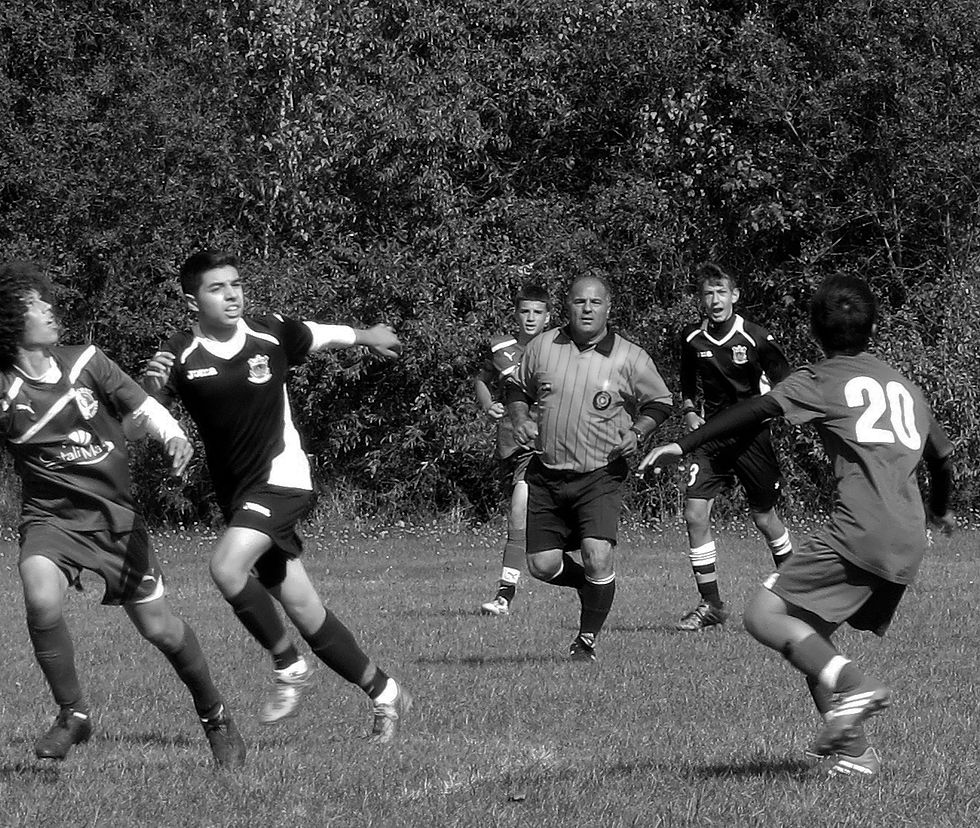
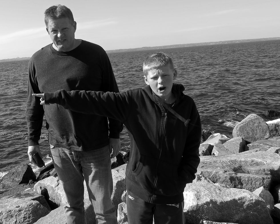
Photos 1 and 3 were by far my absolute favorite of the collection, but the other photos each still offer a great spectrum of emotions! The 2nd and 4th photos were taken during my brother's soccer games this past season. I tried to capture the players while they were mid play, because that's when their determination and fight could be really clearly seen on their faces. The emotions are true and not staged in any way, which I love. The only problem with these photos is that, because it was on a very close up zoom and the sun was shining brightly onto the field, the photos take on a not-as-great range of colors, contrasts, and pixelations. The focus's also got a little mixed up, specifically in the 4th photo where the camera decided the tree was more interesting than the players. Overall, even with the small techincal difficulties, the photo's show great emotion of the players and their perseverance during the game, which is why I chose to keep them. In the 5th photo, I captured a photo of my dad and my brother as they were trying to decide where to walk next on a rocky water path in Scituat. As staged as this could come off, this photo just happened to be taken right in the moment, hence the funny expressions on their faces. This photo shows off my dad and my brother's goofy nature. I chose to arrange it so that they were slightly allighned to the left so that the rocks and water could be seen in the background, which help added to an adventurous feeling! Even though it's not my best photo, I think it's still pretty great because the emotions really come through. Overall, I love all of these photos and the wide range of emotions they convey!
ASSIGNMENT 4 - NIGHT PHOTOGRAPHY
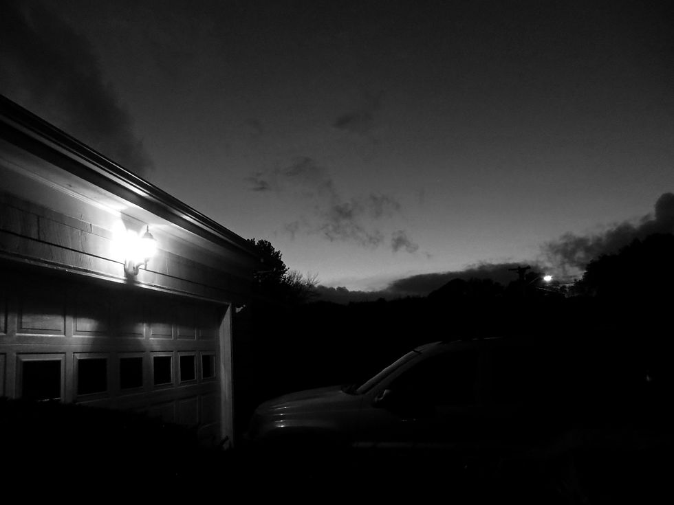

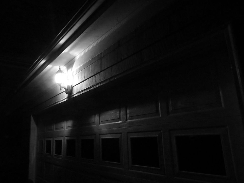


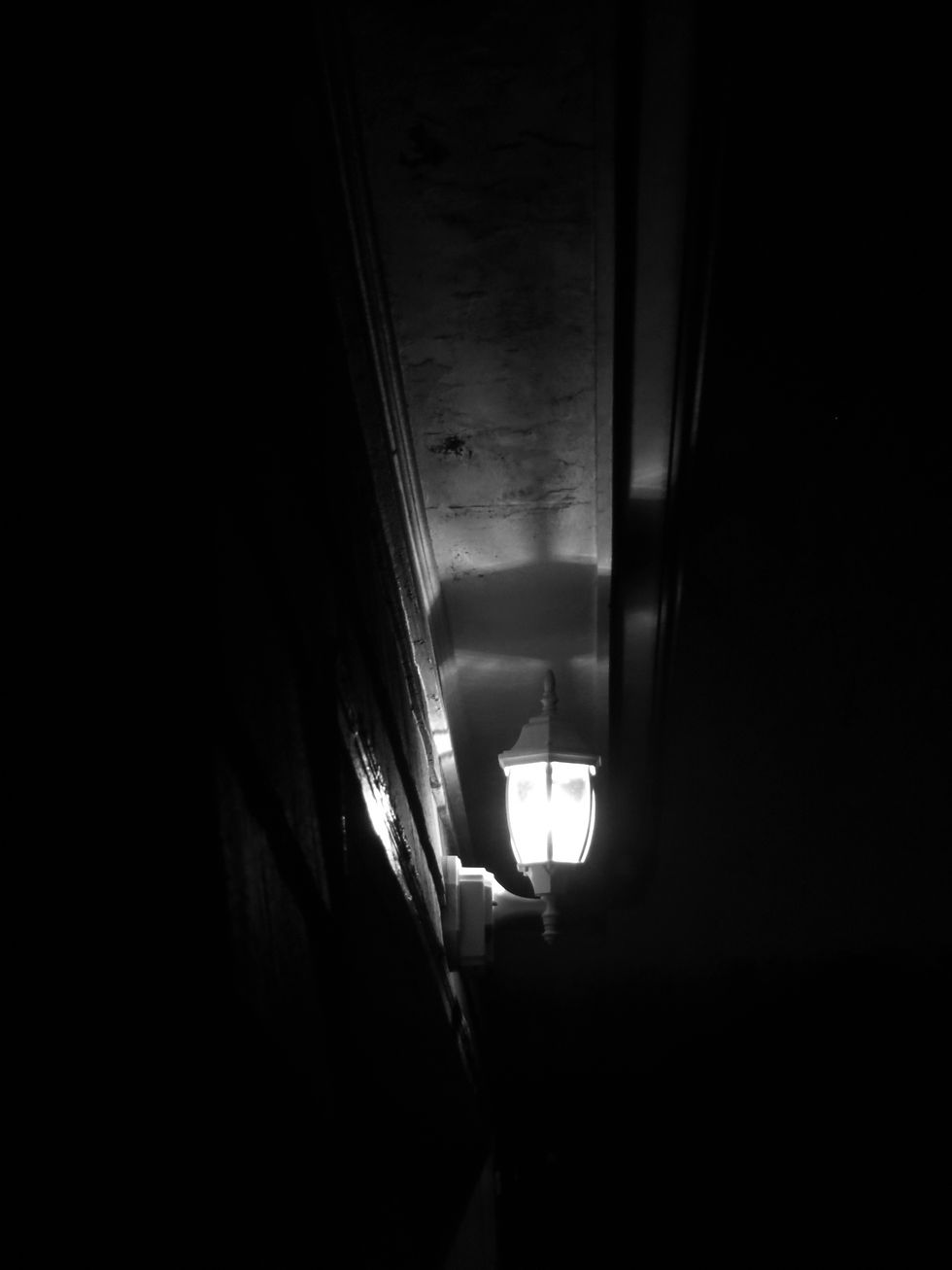

window, far away shots from my yard, angled upwards shots of the garage roof, and directly onward shots. Putting these photos in black and white really emphasized the fact that it was nighttime, because it made the lights stronger and added darkness that originally wasn't as present. I kept my camera on its original settings: I didn't alter the photos to black and white until I was in photoshop. I also didn't use the same black and white effect on each one. In photoshop theres about 6 different types of black and white you can choose to add to your photo, so I tested each one on each photo and picked whatever worked best. Aside from the black and white effects, I added extenstive edits to make the contrast and the exposures much more defined and controlled. The lights in some of the shots came out very strong, so I had to work with the exposure to make sure the light didn't dominate the photo too much. There were also lots of shadows, but they got lost in the shot with all the light, so I upped the contrast and messed with the levels to get the shadows much darker and more defined! Ultimately I think these photos came out great! They showcase a range of editing techniques. They also take something as overlooked as a street lamp or a garage and turn them into something really dynamic and interesting! These photos, and others I took that night that I chose not to post in this set, are also going to be great basis shots for our next assignment, spooky stories!
This photoset conveys a wide range of black and white nighttime photography! I took all of these photos around my house at around 7:00 PM, when the sun had just gone down. One of the photos, number 3, was taken a different day, around the same time, but on a rainy night, which is why raindrops can be seen on the glass. The photos focus a lot on the man made lights that were already present around my house. Each photo contains either a lantern from the front of my garage or a street lamp. I also tried to include the things that they were illuminating, which was mostly my garage, the window glass, the street, some bushes/trees, or the car next to our garage. Knowing that the photos were pretty basic in terms of composistion due to lack of interesting things, I decided to play around with taking the photos at different angles to make each photo more unique, even though they were all made up of the same basic subject matter. I took diagonal shots against the